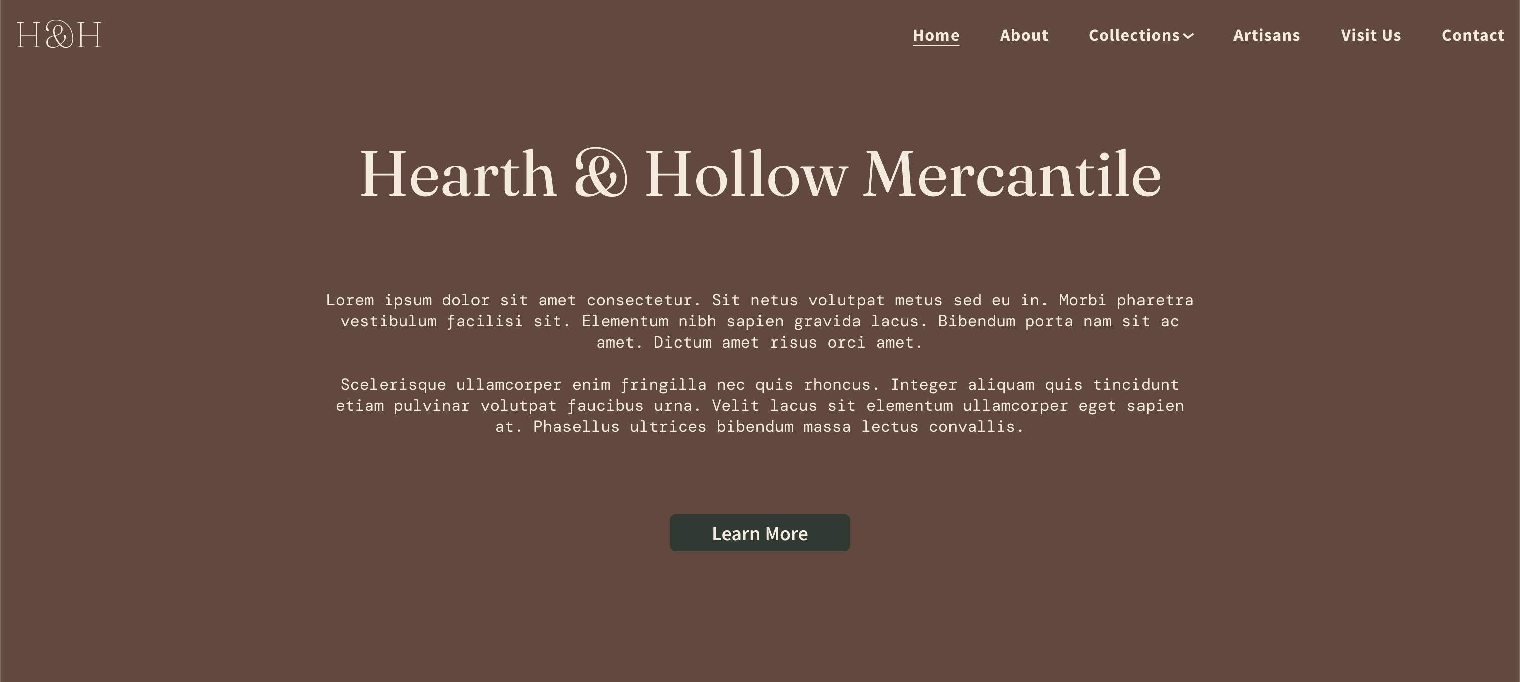
Hearth & Hollow Mercantile
Overview
Hearth & Hollow Mercantile is a curated lifestyle boutique selling handcrafted goods, home essentials, and artisan made products. The client wanted a full redesign of their website to match their warm, rustic brand identity while improving clarity, navigation, and overall shopping experience. I designed a full desktop and mobile experience, established UI patterns, and delivered a polished prototype ready for development handoff.
The Problem
The original direction lacked cohesion and didn’t fully express the brand’s storytelling. Key issues included:
- Weak hierarchy and uneven spacing
- Unclear navigation structure
- Inconsistent card styles
- Minimal brand personality and no emotional pull
- No mobile first structure
- No interaction states or responsiveness planning
- The client needed a design that felt inviting, handcrafted, and premium while still being clean, readable, and easy to shop.
Goals
Create a warm, timeless brand inspired layout that establishes a clear card system for products & collections, strengthens storytelling, improves button, text, and spacing consistency, and creates a scalable component style for future pages
Research & Brand DirectionI analyzed competitor sites in the rustic/lifestyle/handcrafted space, moodboarding references the client shared, and common e-commerce patterns. I identified a visual direction being earthy neutrals, serif headlines, minimal modern layout, and warm lifestyle photography.
Wireframes & StructureI created low-fidelity layouts that defined clear spacing rhythm, a collapsible hamburger navigation for mobile, and a modular card layout that works on any screen size. This ensured a clean UX foundation before visual styling.
High-Fidelity UI DesignOnce approved, I built detailed desktop and mobile screens:
- 20px body text for readability
- Elegant serif headers
- Strong typographic hierarchy
- Reusable product and collection cards
- Buttons with hover and tap states
- Navigation bar and mobile menu
- Quote component for storytelling
- Consistent image cropping
- Clean spacing grid
I verified every section for tap targets, spacing, responsiveness, and user flow.
← Back to Projects
