Libby Redesign
The idea
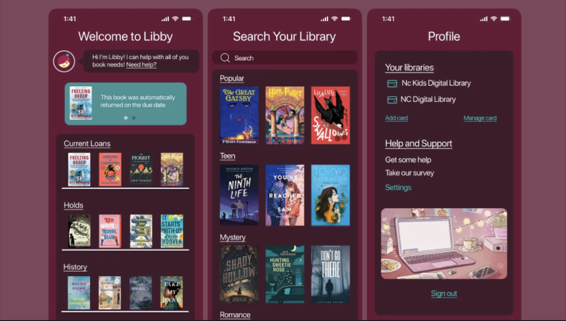
Libby is a library app used by all ages. I wanted to make it more accessible, visually appealing, and easy to navigate.
The Process
I selected a primary accent color (#671936) with alternative swatches for accessibility. Screens were reorganized for clarity, prioritizing Home, Search, and Profile. I enhanced visual hierarchy using color and spacing while keeping the experience intuitive.
The Result
A colorful, user-friendly redesign that’s inclusive for all users, with clear navigation, better contrast, and improved readability.
← Back to Projects