Rotary 7690 Website Redesign
The Reason
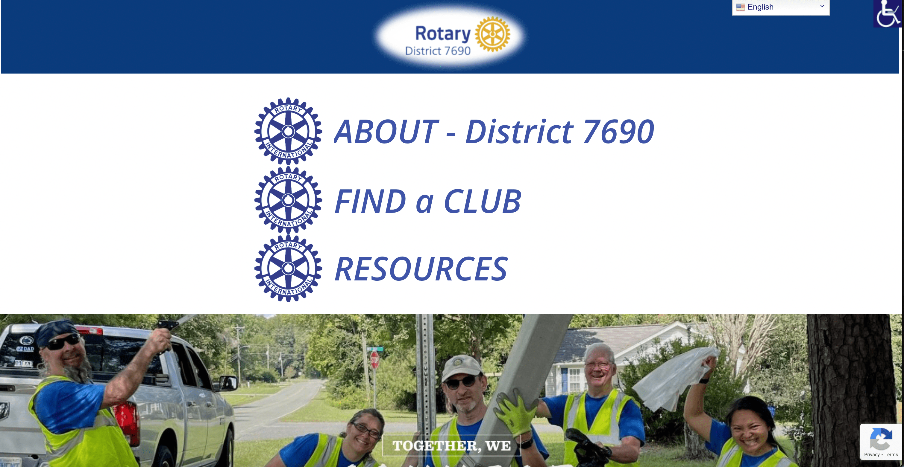
Rotary 7690 wanted a modern redesign to replace their outdated website, which suffered from inconsistent layouts, poor readability, and limited visual hierarchy. The goal was to create a clean, professional experience that would make information easier to read and navigate while improving the organization’s overall digital presence.
The Process
Research & PlanningI began by reviewing the existing site and identifying where users might struggle, such as crowded text blocks, uneven spacing, and confusing navigation. I also asked simple usability questions to understand first impressions: “Is this readable?” “Would you click around more?”
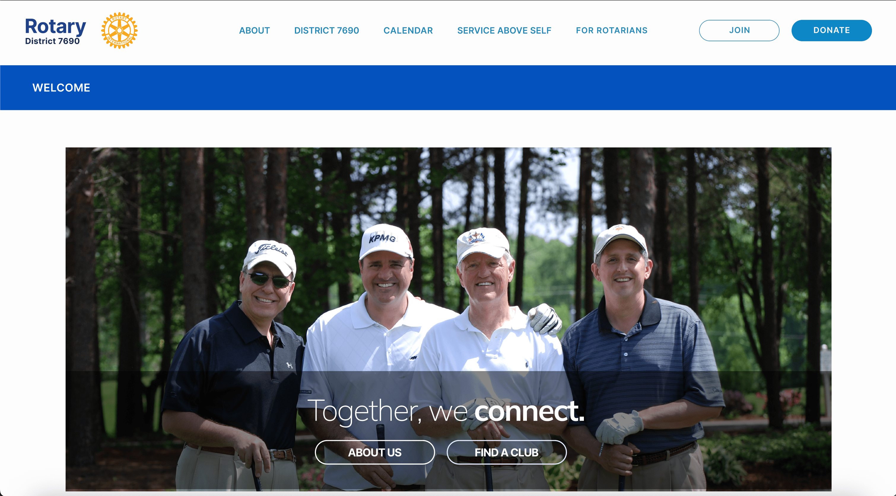
Wireframing & DesignUsing Figma, I developed wireframes emphasizing structure and readability. Once approved, I created high-fidelity mockups that established a consistent design flow, modern color palette, and balanced typography.
Iteration & ExecutionWhen the project scope expanded, I rebuilt eight previously approved pages from an older design and completed the remaining pages, ensuring consistent spacing and flow across 21 total pages.
Testing & FeedbackI conducted brief user testing sessions to gauge how the new design felt to visitors. The feedback highlighted that the redesign felt cleaner, more professional, and easier to explore.
The Result
The final product provided Rotary 7690 with a cohesive, visually engaging, and user-friendly website. Their team praised the redesign for its clarity and modern appeal and noted that I was “wonderful to work with” throughout the project. This experience strengthened my ability to adapt quickly, manage changing project scopes, and balance speed with thoughtful design decisions.
← Back to Projects