YouTube Recreation Challenge
The Reason
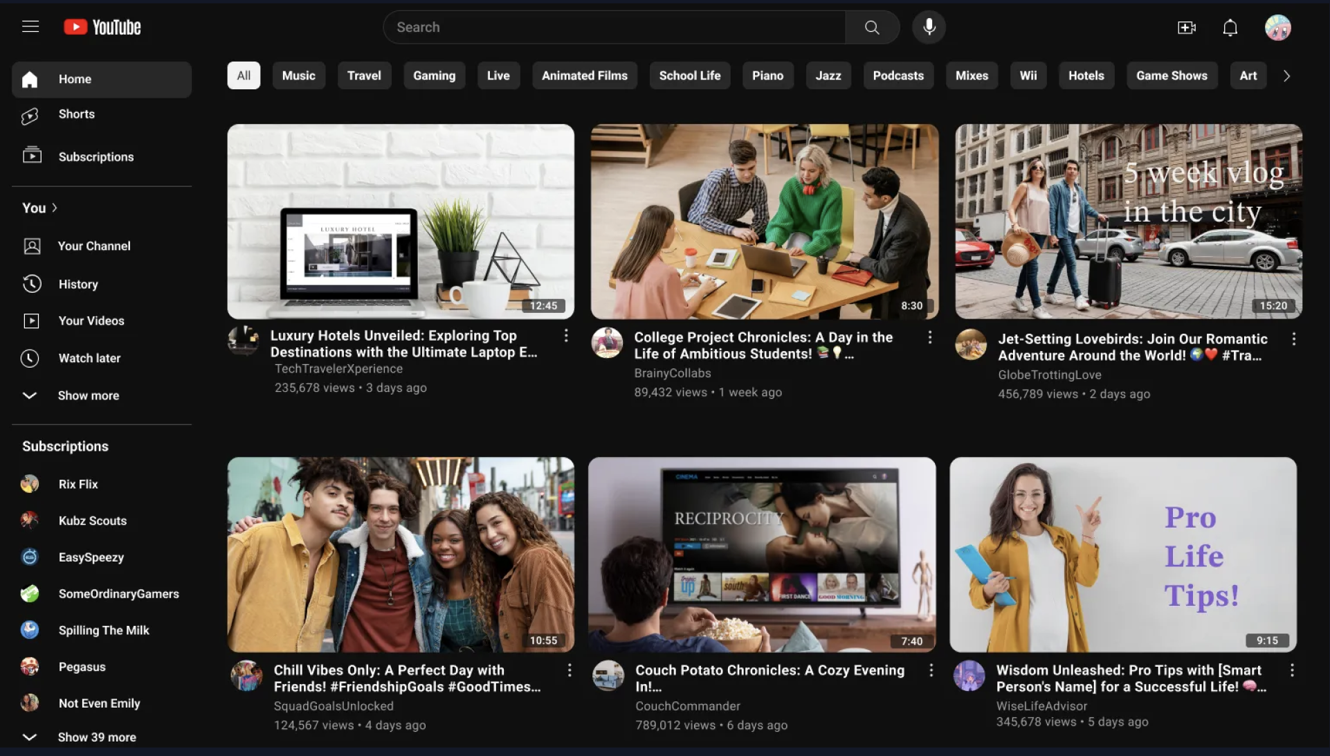
This challenge came from a mentor who told me, “If you can recreate YouTube, you can design anything.” The goal was to test my ability to rebuild a complex, real-world interface using only observation and design fundamentals.
The Process
Analysis & LayoutStarting with a screenshot of YouTube’s homepage, I analyzed the spacing, proportions, and visual hierarchy. Every detail, from the grid system to the alignment of icons, was recreated by hand.
Design ExecutionI built every element from scratch, including all vector icons, cards, and text styles. The only reference I allowed myself was the screenshot. No templates or assets were used.
Testing & ComparisonWhen shown side-by-side with the real YouTube homepage, people couldn’t immediately tell them apart. This exercise taught me how to spot micro-level spacing and hierarchy patterns that define well designed interfaces.
The Result
The YouTube recreation strengthened my understanding of grid-based layouts, typography, and component consistency. It pushed me to pay attention to fine details skills I now apply to every design I create.
← Back to Projects